If you're new to web design, understanding how to create a landing page that converts visitors into customers can seem overwhelming. But don't worry! We'll break down the basics of User Experience (UX), the information you need to provide, and the technical elements that make a landing page effective. Let's dive in!
Why UX (User Experience) is Important
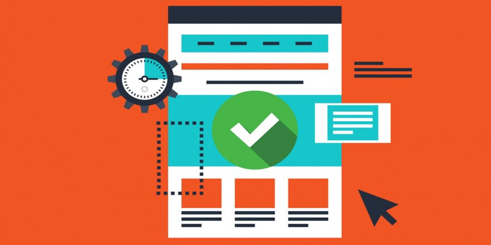
User Experience (UX) refers to how a user feels when interacting with your website. A good UX means that visitors can easily navigate your site, find what they're looking for, and take the desired action (like making a purchase or signing up for your service). Here's why it matters:
- First Impressions Count: It takes only a few seconds for visitors to decide whether they want to stay or leave your page. A confusing or unattractive design can drive potential customers away.
- Increased Conversions: A well-designed page that guides the user through the decision-making process smoothly can significantly boost your conversion rates.
- Builds Trust: A clean, professional look makes users trust your brand more, increasing the chances they'll engage with your offering.
What is a Landing Page?
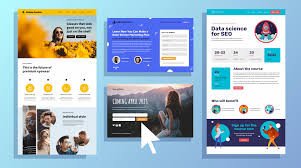
A landing page is a specially designed webpage that has one primary goal: to convert visitors into leads or customers. Unlike a typical webpage that may have multiple links or a variety of information, a landing page is focused and encourages users to take a single action, like signing up for a newsletter, making a purchase, or downloading an eBook.
Let's break it down in simple terms.
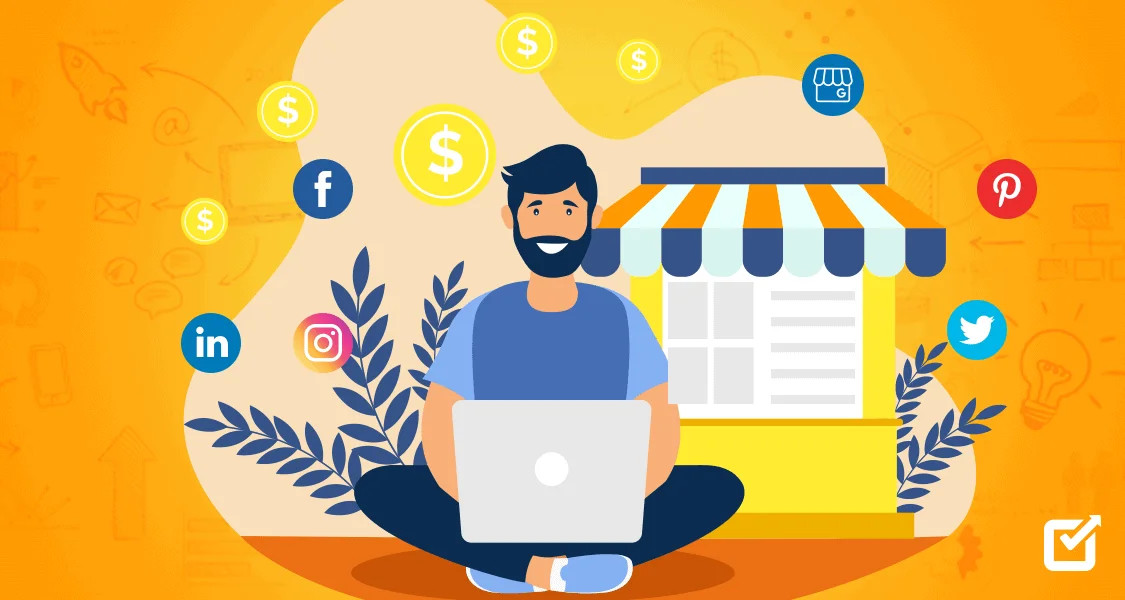
Why Do You Need a Landing Page?
Landing pages are powerful tools for generating leads and sales because they are focused on converting visitors. Here's why they're useful:
- Increase Conversions Since landing pages are built around a single purpose, they are more likely to convert users into leads or customers. The streamlined design and clear messaging help users understand what they need to do.
- Track Campaign Success Landing pages are often tied to marketing campaigns. Because they're focused on one goal, it's easy to measure how well the page performs by tracking how many visitors take the desired action (like signing up or making a purchase).
- Collect User Information Many landing pages have forms to collect user information such as email addresses or phone numbers. This helps build a list of leads for future marketing efforts.
What is a Landing Page? (A Simple Guide for Beginners)
A landing page is a specially designed webpage that has one primary goal: to convert visitors into leads or customers. Unlike a typical webpage that may have multiple links or a variety of information, a landing page is focused and encourages users to take a single action, like signing up for a newsletter, making a purchase, or downloading an eBook.
Let's break it down in simple terms.
Key Features of a Landing Page
- Focused on One Goal
The biggest difference between a landing page and other pages on a website (like a homepage) is its singular focus. A landing page usually revolves around one product, offer, or service and is designed to push users toward taking one specific action. This action is called a Call to Action (CTA).Example: A landing page for a seafood delivery service might ask users to "Order Fresh Seafood Now" and include a form for them to fill out.
- Minimal Distractions
A landing page is clean and simple. Unlike a homepage that might have menus, multiple links, or lots of content, a landing page keeps distractions to a minimum. The idea is to keep the user focused on the CTA without any side elements drawing attention away.
- Targeted Traffic
Landing pages are often created for specific marketing campaigns. For example, if you're running a Facebook ad to promote a free eBook, clicking on the ad will take users directly to the landing page for that eBook. The page's entire purpose is to convince users to download the book by giving them more information and an easy way to sign up.
- Call to Action (CTA)
The CTA is the most critical part of a landing page. It's the action you want the user to take, such as:- Signing up for a newsletter
- Downloading a guide
- Making a purchase
- Registering for a webinar
The CTA usually comes in the form of a button or a form for users to fill out. A strong landing page will make this action clear and easy to complete.
Common Types of Landing Pages
- Lead Generation Landing Pages
These pages are designed to collect contact information from visitors. The goal is to convert them into leads by asking them to fill out a form in exchange for something valuable, like an eBook or a discount. - Example: "Download our free seafood recipe book. Enter your email to get instant access."
- Click-Through Landing Pages
These are used to "warm up" visitors before taking them to another page, such as a product page or shopping cart. The idea is to provide just enough information to convince users to move to the next step. - Example: A page that introduces a new product and includes a "Learn More" button that takes users to the product page for purchase.
- Sales Landing Pages
The goal of a sales landing page is to directly convert visitors into paying customers. These pages usually have detailed information about a product or service, along with a Buy Now or Order Now button. - Example: A page for a subscription service that explains the benefits of signing up and includes a "Start Your Free Trial" button.
A landing page, on the other hand, is much more focused. It's usually tied to a specific marketing campaign and is created to achieve one goal—whether that's capturing email addresses or selling a product. There's no need for navigation or multiple links on a landing page because the entire purpose is to guide users to a specific action.
Essential Information for Your Landing Page
For a landing page to convert, it must clearly communicate the value of your product or service. Here are the key pieces of information you need:
- Clear Headline: The headline is the first thing users will see, and it should immediately convey what you offer. It should be concise, specific, and attention-grabbing.Example: "Get Fresh, Sustainable Seafood Delivered to Your Doorstep!"
- Compelling Subheadline: The subheadline should complement the headline and provide a bit more detail.Example: "Order today and enjoy next-day delivery of the freshest catches from the sea."
- Benefits, Not Just Features: Explain the benefits of your product/service. Instead of focusing only on what it does, highlight how it will improve the user's life.Example: "Our seafood is sourced directly from local fishermen, ensuring quality, freshness, and support for sustainable practices."
Call to Action (CTA): This is one of the most critical elements of your landing page. It should clearly tell users what to do next (e.g., "Order Now," "Sign Up Today"). Make sure your CTA stands out and is placed in a prominent location. Social Proof: Show potential customers that others are already benefiting from your product. You can do this through testimonials, reviews, or even the number of customers you've served.Example: "Join over 10,000 seafood lovers who trust us for their fresh catch."
Technical Elements to Make Your Landing Page Work
- Fast Loading Speed: No one likes a slow website. Ensure that your page loads quickly, as even a few extra seconds can cause users to abandon your page.
- Mobile Responsiveness: Many people will view your landing page from their smartphones. Make sure the page looks and works well on mobile devices, with easy-to-read text and buttons that are touch-friendly.
- Simple and Clean Design: Avoid clutter. A clean, minimalistic design with plenty of white space allows users to focus on your message. Too many elements can distract and overwhelm them.
- Optimized for SEO: Include relevant keywords in your headline, subheadings, and throughout the page to ensure it ranks well in search engines. This will help bring in organic traffic.
- Forms: If you're collecting user information (like for a newsletter or free trial), make sure the form is short and simple. Ask for the least amount of information necessary (e.g., name and email). Long forms can scare away potential leads.
- Analytics: Use tools like Google Analytics to track how users interact with your page. This will help you understand what's working and what's not, so you can make improvements over time.
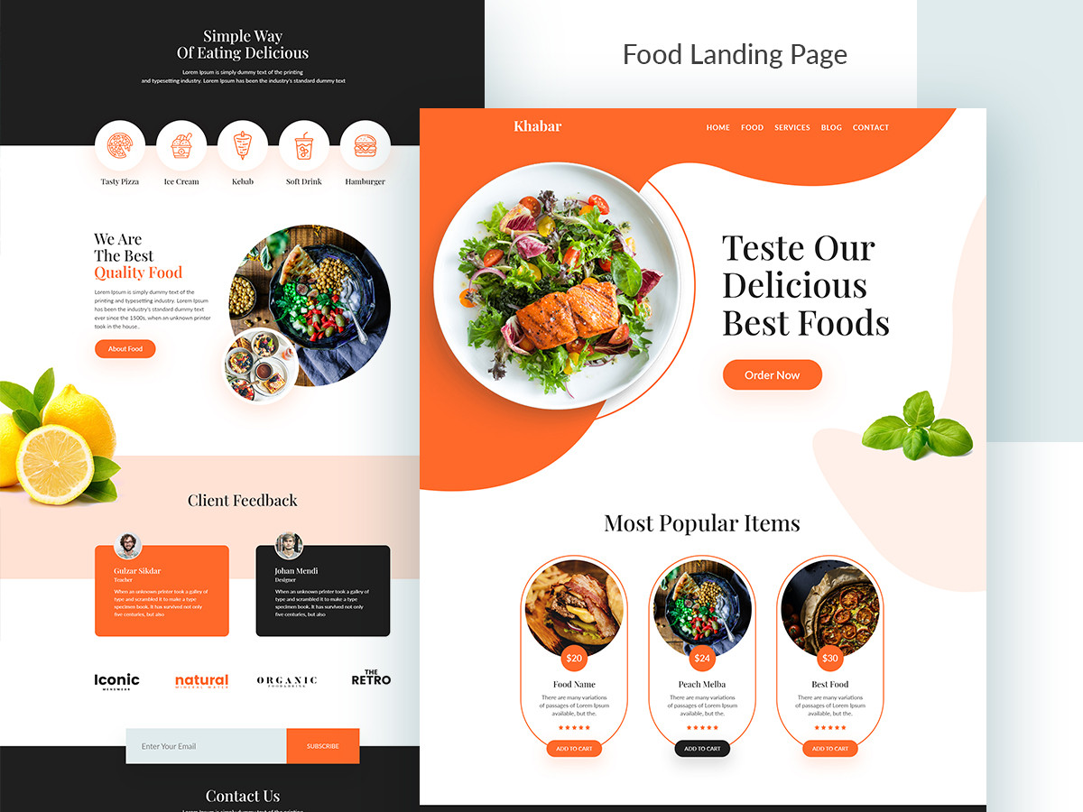
1. Hero Section (Above-the-Fold Block)
The hero section is the first thing visitors see when they land on your page, so it must make a strong impact. This block typically includes:
- Main Headline: Clear, bold, and attention-grabbing to quickly communicate your value proposition.
- Subheadline: A brief description or benefit statement that supports the headline.
- Call to Action (CTA): A prominent button like "Sign Up Now" or "Get Started" to direct users to the next step.
- Visual Elements: An image or video that represents your product or service.
Example:
- Headline: "Fresh Seafood Delivered to Your Door"
- Subheadline: "Get fresh, locally sourced seafood with free next-day delivery."
- CTA: "Order Now"
2. Value Proposition Block
This block explains why your product or service is the best choice for the user. It highlights the unique value you offer, focusing on the most critical benefits.
- Key Benefits: Use bullet points or short paragraphs to showcase the top 3-5 benefits.
- Icons or Visuals: Reinforce each benefit with simple icons or images.
Example:
- "Freshly caught daily."
- "Sustainably sourced from local fishermen."
- "Free next-day delivery for all orders."
3. Features & Benefits Block
In this section, you provide a deeper dive into the features and benefits of your offering. The goal is to convince users how your product solves their problems or improves their life.
- Feature Highlights: Explain the features in detail, but focus on how they benefit the user.
- Benefit-Oriented Descriptions: Highlight what's in it for the user by framing the benefits around their needs.
Example:
- Feature: "Real-time tracking of your seafood delivery."
- Benefit: "Know exactly when your seafood arrives, ensuring the freshest quality."
4. Social Proof Block
People trust the opinions of others. Including social proof is one of the most effective ways to build trust and credibility. This block can feature:
- Customer Testimonials: Display quotes from satisfied customers along with their photos (if possible).
- Case Studies: Provide a short success story from a real user.
- Product Reviews/Star Ratings: Showcase average ratings or detailed reviews from real users.
- Logos of Clients/Partners: Show brands or companies that trust your product or service.
Example:
- Testimonial: "Fish House BGD delivered the freshest seafood I've ever had. The quality is unmatched!" — Sarah, a happy customer.
5. Visual Showcase Block
Show, don't just tell. This block allows you to present images, videos, or animations that showcase your product in action.
- Gallery or Slideshow: Highlight different aspects of your product or service with high-quality images.
- Video Demonstration: Include a short, engaging video that shows how your product works.
Example:
A video of how your seafood is sourced, prepared, and delivered, emphasizing the freshness and sustainability.
6. How It Works Block
Simplify the user journey by explaining how your product or service works in 3-4 simple steps. This block reassures users that the process is easy and intuitive.
- Step-by-Step Process: Outline the steps from signing up to receiving their product or service.
- Visuals for Each Step: Use icons or small images to make the process visually clear.
Example:
- Choose your seafood package.
- Schedule your delivery.
- Enjoy fresh seafood at your doorstep.
7. Pricing Block
Make the pricing clear and transparent to avoid any confusion. This block should emphasize the value customers are getting for the price.
- Pricing Tiers: If applicable, showcase different pricing plans or packages.
- Inclusions and Benefits: Make it clear what each pricing tier includes and how it benefits the user.
- Discounts or Offers: Highlight any ongoing promotions, discounts, or free trials.
Example:
- "Order today and get 20% off your first purchase!"
- "Free delivery on orders over $50."
8. FAQs Block (Frequently Asked Questions)
Anticipate and answer common questions to alleviate doubts and remove friction from the conversion process.
- Top Questions: Address common concerns like shipping, product quality, refund policies, etc.
- Clear, Concise Answers: Use straightforward language to answer questions quickly and clearly.
Example:
- Question: "How fresh is the seafood?"
- Answer: "Our seafood is delivered within 24 hours of being caught, ensuring peak freshness."
9. Guarantee/Trust Block
Offering guarantees or showcasing security measures can ease any hesitations users may have.
- Money-Back Guarantee: Reassure users with a no-risk offer, such as a satisfaction or money-back guarantee.
- Security Badges: Include badges that show your site is secure, such as SSL or trust certifications.
- Free Trial Offer: If applicable, offer a free trial to encourage sign-ups.
Example:
- "100% satisfaction guarantee or your money back."
- "Secure payments with SSL encryption."
10. Final CTA Block (Footer CTA)
As users scroll to the end of your landing page, offer a final opportunity to convert. This block typically reinforces the main CTA and adds urgency or a limited-time offer.
- CTA Button: Repeat your primary CTA in the footer for one last push.
- Urgency: Add a time-sensitive offer to create a sense of urgency (e.g., "Limited Time Offer: 20% Off Ends Today").
- Social Proof: Reinforce with a testimonial or small trust indicator.
Example:
- CTA: "Order Now – Fresh Seafood Delivered Tomorrow!"
- Urgency: "Order by 5 PM for next-day delivery."
Final Thoughts By organizing your landing page into clear UX blocks, you guide users through a seamless experience that builds trust, educates them, and encourages conversion. A combination of compelling messaging, strong visuals, and a clear call to action will result in a high-converting landing page.
Final Thoughts
By organizing your landing page into clear UX blocks, you guide users through a seamless experience that builds trust, educates them, and encourages conversion. A combination of compelling messaging, strong visuals, and a clear call to action will result in a high-converting landing page.