b. Accompanying title
Since headlines need to be short and sweet, sometimes you'll use a subheading to provide a little extra information. However, don't get carried away here either. As with titles, shorter is better. The auxiliary title can have two approaches: It can act as a direct extension of the title, essentially ending the thought. (Your title should still stand for itself.)
Or it can offer additional value or convey a secondary persuasive message that is still tied to your headline.
c. Supporting Statement (optional)
If your landing page takes a long time, it makes sense to remind visitors of your USP with a reinforcing statement towards the middle of the page.
When writing it, consider what your reader knows and doesn't know when they first click. What do they know now that they didn't before? How can you drive your USP home now that they are sufficiently prepared and emphasized?
d. Closing statement (optional)
The closing statement supports your unique selling proposition and gives your visitor one last chance to convert. It's your mic drop, the highlight of the story you tell about your offer, so make it count.
A strong closing statement can provide a little urgency or might remind the visitor why they are there in the first place. For a click-through rate page, it should also repeat your call to action (see below) to eliminate the need to scroll back.
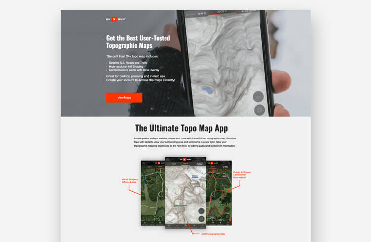
A picture or video that makes a difference
First impressions are important, and the "main character" image (or background video) is probably the first visual element of your landing page that visitors will see.
Ideally, the hero image should reflect the context of use. If you run a SaaS company, this could be your killer app running on a sleek modern device. Or, if you're in ecommerce, it could be someone blowing a giant bubble of your vegan gum.
(If you can convey emotion using real people, even better, but avoid using silly images that will sound fake.)
Integrated copy and landing page design
Whether you're a marketing team juggling designer and copywriter hats or working in a department with design and content groups, your visuals and your words (hopefully powerful words) can easily start in silos. This year, you might want to change that.
Check out this great example from Coda, a similar concept tool for collaboratively creating documents and lists. The realistic cartoon visual of the umbrella-tailed lizard contrasts nicely with the rest of the neutral, modern page — and the headline makes for a tongue-in-cheek copy/design.
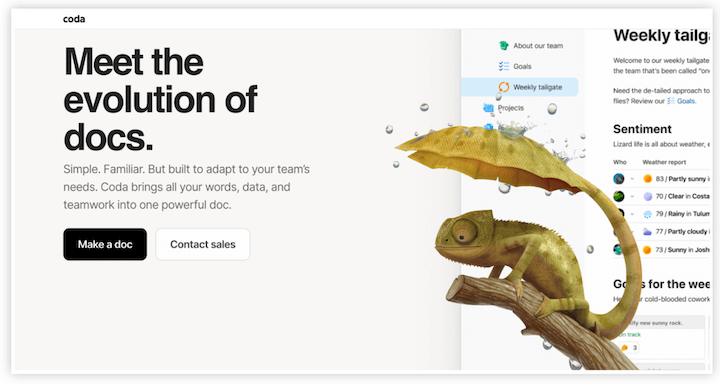
Source Coda
Benefits and features
Your landing page needs supporting copy beyond your headline to convince most people. The key here is to describe the benefits along with the features.
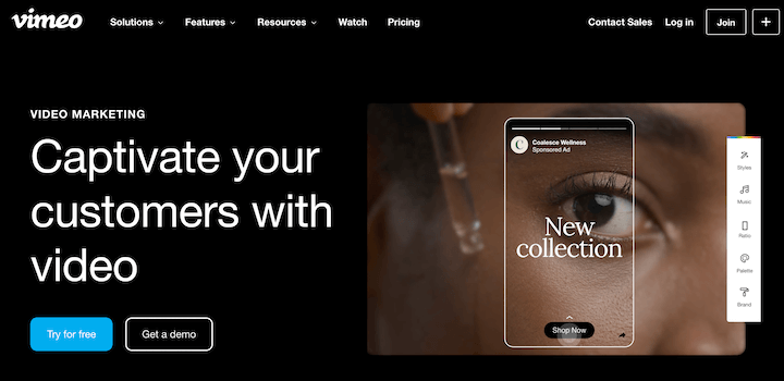
Source: VIDEO
The videos shown here show the various product capabilities in short shorts, and the gallery setting allows users to go back if they wish. Vimeo also does a great job of integrating product videos into their page design and using the asset to drive conversion more subtly.
Customer Reviews/Social Proof
If you currently run a small business, you know that your online reviews are important. Whether it's praise on social media, a Google My Business review, or a suggestion on Reddit, an unsolicited positive view of your goods or services is valuable social proof. It lets you know what your current customers enjoy and, even more, it gives your potential customers a personalized recommendation. And we all trust personalized recommendations more than even the best ad copy or images.
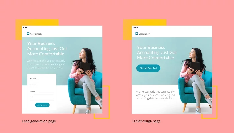
Photo: Camaeleon
Last but not least, a landing page should focus on only one conversion goal — otherwise it's not a landing page (see the previous section). This is presented to your visitor as a call to action (CTA), which can either be a stand-alone button on a click-through page or a form on a landing page designed to generate leads.
What's interesting is that it's not so much the colors themselves that drive conversions, but the contrast of the colors used. That's why the red and green button debate has produced so many different results.
This contrast is also seen in the form of drop shadows and adding depth to previously flat landing pages.
In 2022, we saw the creative use of different color combinations to express the mood and emotions related to the brand/campaign.
We'll see this creativity continue in 2023 with bright colors making a comeback thanks to the 80s and 90s nostalgia trend that permeates everything from fashion to children's toys.
You'll also want to start exploring the use of gradients, subtle color overlays, and eye-catching backgrounds.
Apart from these basic elements, there are also additional elements that, depending on the products and services offered by the lending party, can add value to the overall impression...
Playful buttons
Trends in design or copy are great inspiration for experimentation, but at the end of the day, the best landing page is a high-converting landing page.
But that doesn't mean your buttons have to be superficially "submit" or, for that matter, big and orange. In fact, Unbounce found that refining your call-to-action button can improve your conversion rate by up to 90%. Changing your call-to-action is a great way to start playing with landing page buttons
You can stick to creative copy or test the design. Lemonade, a pet insurance company, does this so well. The landing page design has a minimal black, white and gray design with cartoon cats and dogs in motion, plus bright pink accents and branding buttons. Some of these elements work on the page—including one of the little pets and buttons.

Micro animations
Animation on your landing page is great for keeping the user's attention and making their stay on the page memorable. (Lemonade page pets? Lovely.) But animations can also help direct a user to interact with your page. Micro animations are UI design tools that guide the user to move further down the page or take an action. This is something you'll want to try in 2023. This can be as simple as links that change color when a user hovers over them as a subtle incentive to click, or as complex as something like this submit button.

Look Animation
How-to sections
Although the goal of each landing page will be to convert visitors, the content will vary. It could be a free trial promotion. Register for an event or webinar. Product overview to book a demo.
All of these could benefit from a how-to section.
People like visuals and lists to break up larger topics. In fact, Semrush found that listing pages for every 500 words get 70% more traffic. Even though your landing page isn't an article or blog post, it's the page you want to drive traffic to. This significant increase in traffic is worth a try.
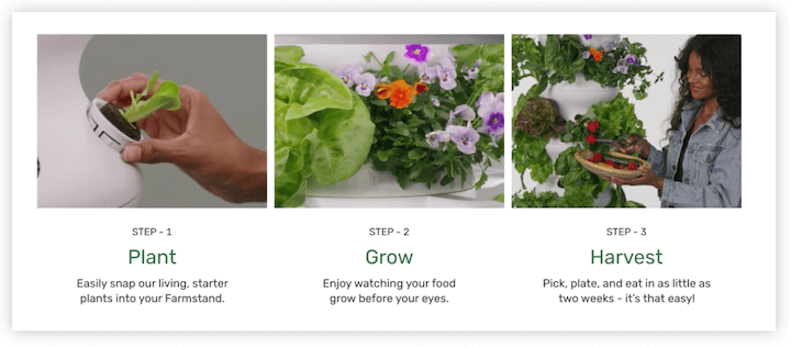
Check out this example from growing lettuce.
Dreamy background
So far we've looked at many elements of landing pages, including copy, images, video, design. But we haven't talked about one big element: the background. This year, we can expect to see even more dreamy gradients in the background of the landing page.
Google made Core Web Vitals a ranking factor earlier this year, and another update is expected in early 2022. That means fast loading times are more important than ever. Making sure your images are compressed and that your page has lazy loading enabled are good places to start. A dreamy, gradient background can also add depth to your design without increasing load times.
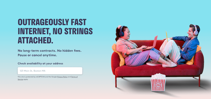
Here's a great example of this in action from Starry Internet.
Coral
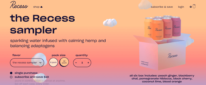
Pantone has released its predictions for 2022: warm, familiar, comforting colors. Top of the bucket list for next spring? Coral. This will also be a trending landing page.
This color fits into some of the bigger themes we've seen here - dreamy, approachable, playful, simple. The color is warm and bright, making it ideal for backgrounds or accents on your page. Or, you can go all-in, as Recess does on its landing page below.
Modern minimalism
We hate to talk about it, but less is definitely more! Minimalist designs are popping up everywhere in an attempt to deal with consumer information overload.
Does that mean your entire landing page has to be full of white space and monotone accents? Not! Colorful minimalism is 100% on trend right now and experimenting with some bold colors can make your page stand out even more.
In addition to improving cognitive load, minimalism also ensures faster load times that increase conversion rates.
A delay in loading speed of one to ten seconds increases the likelihood of a visitor to bounce by 123%.
Another aspect is the removal of exit features such as mega navigation bars, social icons, footer links and so on, in favor of a single primary link and conversion goal. Reducing the number of choices your visitors have to make gives them a clearer direction and makes it easier for them to convert.
Here are some key factors to consider when using a modern minimalist landing page:
Simple and direct copy (text) - less words, more impact!
Almost 30% of landing pages have too much copy – A study showed that business landing pages with less than 100 words converted 50% better than those with 500 words or more.
A clear, direct title.
White space, or yellow, or blue. Whatever you choose, keep your pages clean and uncluttered and use a few select colors.
One clear CTA - using contrasting CTA colors to grab attention.
Finally, keep in mind that readability increases by roughly 11.8% in line with copy length, so keep your landing page copy short – say 250-300 words – unless you're selling software that's a more complicated, complex product like a SaaS product .
Sources: Wordstream/Hubspot/Marketsplash
When you subscribe to the blog, we will send you an e-mail when there are new updates on the site so you wouldn't miss them.