Best Landing Page Examples & Why They Convert
Good landing pages are captivating, well-designed, and have a single clear call to action, ultimately increasing conversions. They combine compelling language and effective design to motivate visitors to convert into customers. To fuel your inspiration, we rounded up the best landing page examples from around the web and explained why they work to convert site visitors.
A landing page is a dedicated web page visitors "land" on when they interact with your advertising or marketing campaign to encourage users to take a specific action.
Key Statistics of High-converting Landing Pages
Now that you've seen some of the best landing page examples, you may be wondering what a good conversion rate for landing pages is. Anything above 5% is typically good, but the best landing pages can see conversion rates of 20% or more.
For perspective, a study by Unbounce found that the average conversion rate for landing pages is currently at 4.89%. However, this number varies from industry to industry. Here are other vital landing page statistics to keep in mind:
- On average, landing pages with clickable elements like buttons are 7.2% more effective than those with sign-up forms.
- In 2021, 47% of businesses used video on landing pages. And it's effective—experts found that video can increase conversions by up to 80%.
- Placing a landing page section above the fold on a website can increase conversions by up to 14%.
- Tailoring landing pages to your ideal customer persona can lead to an 11% conversion rate increase.
- Landing pages that load in one second are 17% more effective in converting customers compared to those that take five seconds to load.
Apple Airpods Max's landing page (Source: Apple)
Apple has several great landing page examples, including the product page for Airpods Max. It has a clean, high design that distinguishes Apple from other brands. This creates a sense of aspiration in site visitors to own the featured product. Moreover, it uses a mix of font sizes and widths to highlight key features and comparison tables that help visitors make purchase decisions.
Aside from how the information is presented, Apple makes generous use of high-quality visuals and parallax scrolling. Parallax scrolling is when the images in the foreground and background move at different speeds, giving a page more depth and visual interest.
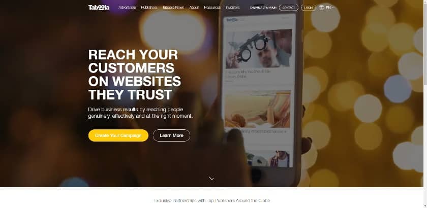
Taboola's landing page offers users two CTAs. (Source: Taboola)
Taboola's home page is where most of its site traffic originates. Like Zova's example, it summarizes its primary selling proposition in the hero section. It then offers two call-to-action (CTA) buttons placed side-by-side.
A site visitor ready to buy can get started, whereas someone who isn't quite ready can access information that might persuade them to take action. Together, these calls to action guide the customer journey—all above the fold. This makes it one of the best landing page examples for businesses offering professional services.
Elespacio: Let the Work Speak for Itself
Elespacio's landing page follows the "show, don't tell" to a tee. (Source: Elespacio)
Elespacio's website home page immediately captivates with a full-screen video background. But beyond being visually compelling, it also follows the tried-and-true "show, don't tell" principle in storytelling by showcasing examples of the agency's work.
This helps site visitors visualize the results they can get and how they'll benefit from the company's services. It's creative, visually appealing, and compelling, and like all the best landing pages, it wraps everything up with clickable CTAs.
SpyFu: Try It Out for Free
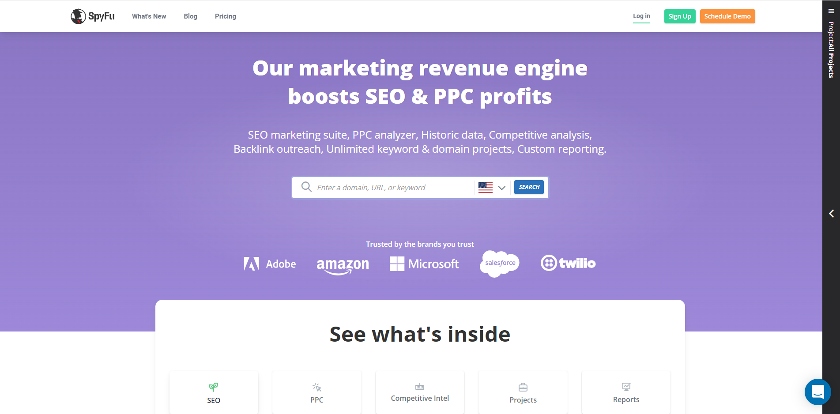
Analytics software SpyFu's landing page (Source: SpyFu)
Analytics software company SpyFu's home page allows users to test-drive its service by entering a domain (e.g., fitsmallbusiness.com), specific page URL, or keyword. It's a tried-and-true strategy—showing users how your service works firsthand before requiring them to sign up helps establish trust. Plus, it also helps get high-quality leads interested in your product.
SpyFu also provides testimonials and reviews further down in the content. This builds on the established trust and supports its value claims, further convincing visitors to convert.
Battesti Associes: Put the Portfolio to Work
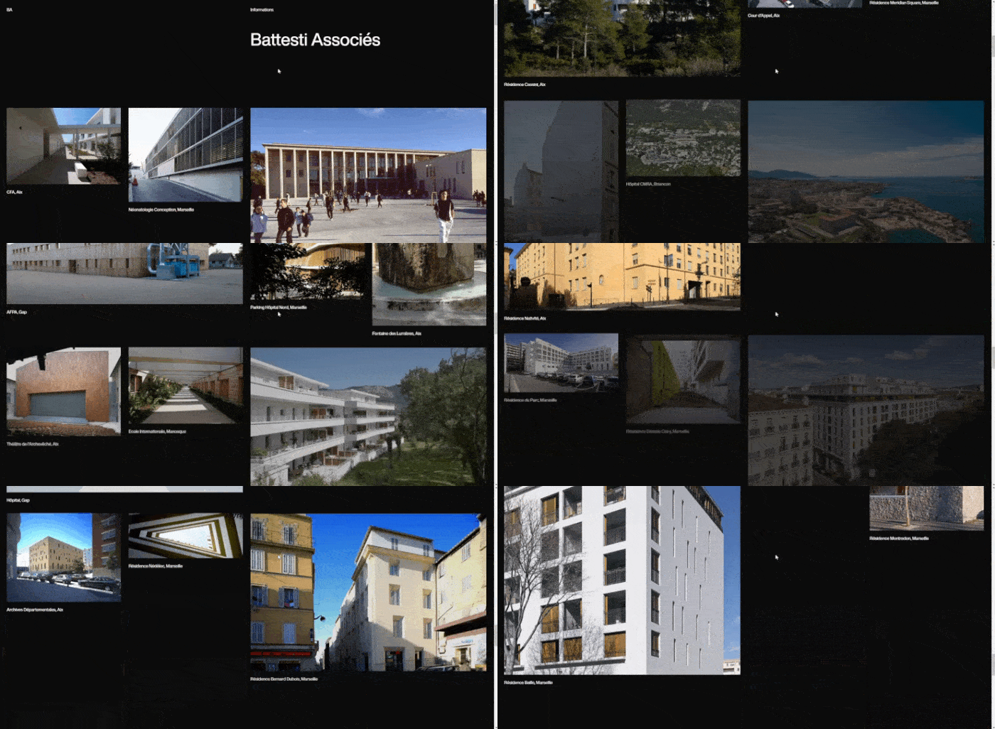
Battesti Associes' landing page streamlines visitors' attention. (Source: Battesti Associes)
Architecture firm Battesti Associes' website home page displays images of past projects, thus eliminating the need to build a separate portfolio. Sparse use of text pulls the site visitor's focus toward the images, then concludes with a simple call to action to get in touch.
Using your portfolio as the main component of a landing page is beneficial in more ways than one. It allows your work to speak for itself, but it also allows your audience to self-identify by immediately understanding if your design style, industry, or type of work is what they are looking for.
Curology: Personalized & Curated Experience
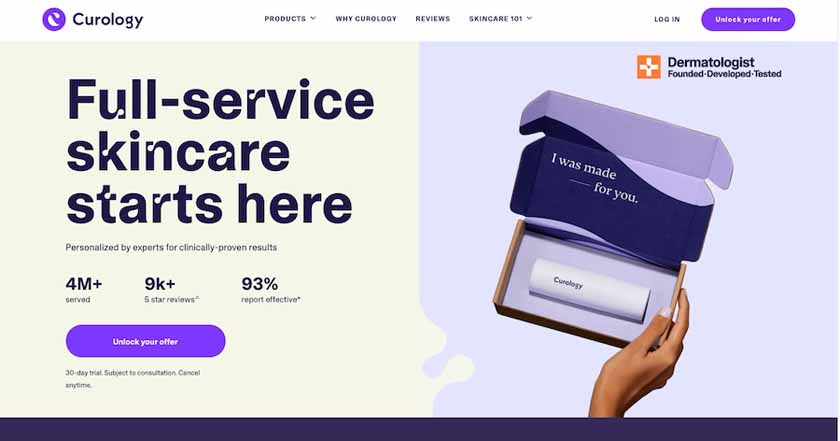
Skincare brand Curology's landing page (Source: Curology)
Curology's landing page promises site visitors a custom, personalized, and exclusive-feeling offer with specific results. They place statistics directly above the CTA as social proof to support the claim made in the headline, thus attracting more clicks and conversions. Overall, it's a great example of how effective copywriting, social proof, and impactful visuals work together to create a high-converting landing page.
In addition, Curology makes great use of color. It divides the page into two, making the selling proposition and call-to-action button stand out. Learn more about how to use colors effectively in web design by reading our guide on how to pick a website color scheme.
Pet Milestone Cards: Directs Site Visitors With Imagery
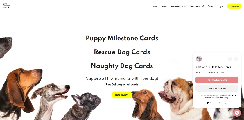
Pet Milestone Cards uses clever visuals to direct attention to what matters. (Source: Pet Milestone Cards)
Have you ever been in a public place and noticed people staring in one direction? Chances are you were immediately compelled to direct your gaze to the same spot. This landing page from Pet Milestone Cards draws your attention to the offer and CTA using a clever background image loaded with cuteness.
All the dogs are looking toward the button, thus directing the visitor's eyes to where they need to click. Aside from smart use of imagery, it also features a clean banner and easy navigation, as it's a one-page website. One-page websites are de facto landing pages—check out our list of the best one-page website examples to see why.
Recess: Subscribe to Save Money
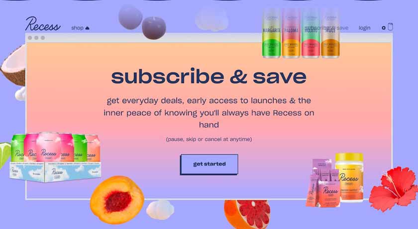
Recess' landing page for subscriptions combines youthful creativity with a conversational copy. (Source: Recess)
Startup beverage brand Recess' "Subscribe & Save" page is a newcomer to our list of the best website landing page examples. It captivates with color and creative, highly stylized branding, but it's especially effective for its conversational, but compelling copy.
The heading immediately delivers the "how" and the "why" in three words: subscribe and save. And on the whole, all of the text feels simple and friendly, which works to convert the brand's target market of young adults on a budget.
Tofu Design: Generates Leads With Design Style
Tofu Design's landing page gives a full user journey. (Source: Tofu Design)
From bold headlines to colorful, interactive graphics, the home page of design studio Tofu Design conveys the distinct design style of the brand. This works to convert site visitors who like the type of designs showcased with an invitation to start a conversation about their own project.
In one scroll, visitors get an introduction to the studio, portfolio examples, a testimonial, and a CTA to get in touch, which leads to an email form. While it isn't a one-page website, it functions similarly to one by giving visitors a comprehensive tour on a single page.
Seal+Co: Use Experience to Inspire Trust
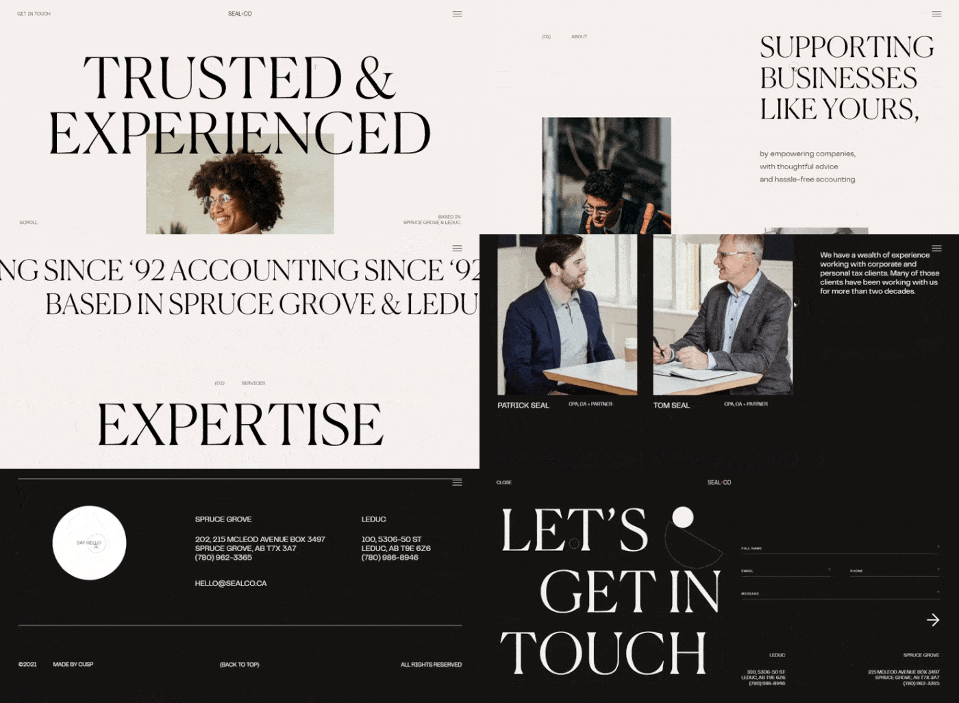
Accounting firm Seal+Co's landing page (Source: Seal+Co)
Firms that deal in money matters often have to build trust just to generate leads, let alone convert them. Accounting firm Seal+Co's visually impactful landing page leverages the company's experience and expertise to convert site visitors. The page also uses parallax scrolling and interactive drop-down boxes to create on-page engagement while giving users an overview of what to expect from the company.
Burga: Get Engagement With Interactive Elements
Burga's interactive and dynamic landing page (Source: Burga)
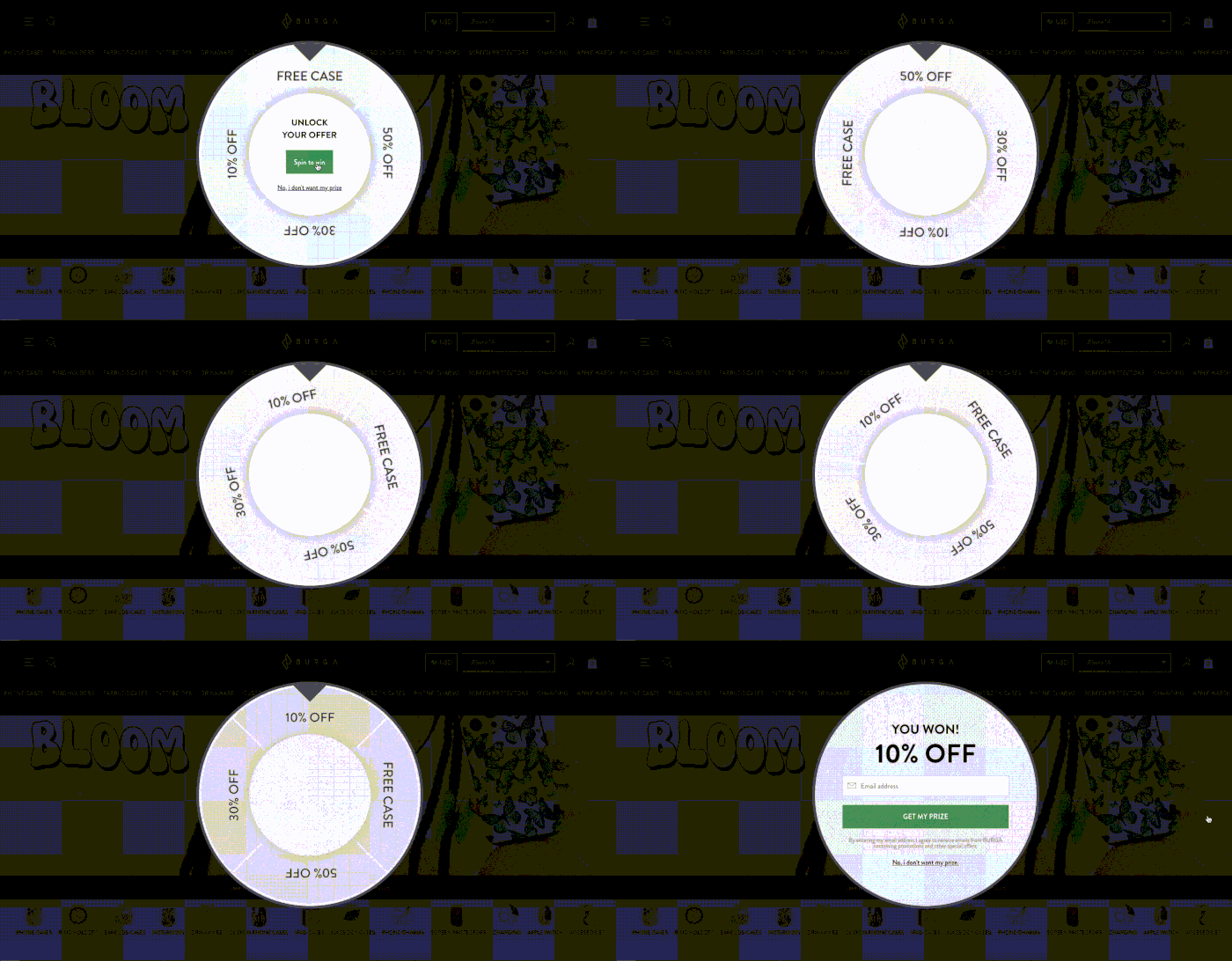
Some of the best examples of landing pages are dynamic and interactive, like that of the accessories brand Burga. It includes an element of gamification by mimicking a "spin the wheel" game, immediately inviting visitors to engage with it. Website visitors only need to click a button to spin the wheel and instantly win a discount or a free case—with the caveat that they provide contact information to redeem the prize.
It's a great example of using animation and interactive elements to create a positive user experience for visitors and entice them to convert. The landing page starts by being interactive, then it offers customers a benefit, before leading to the final sign-up form—creating one of the best-converting landing pages in the process.
Later: Promise Subscribers a Clear Advantage
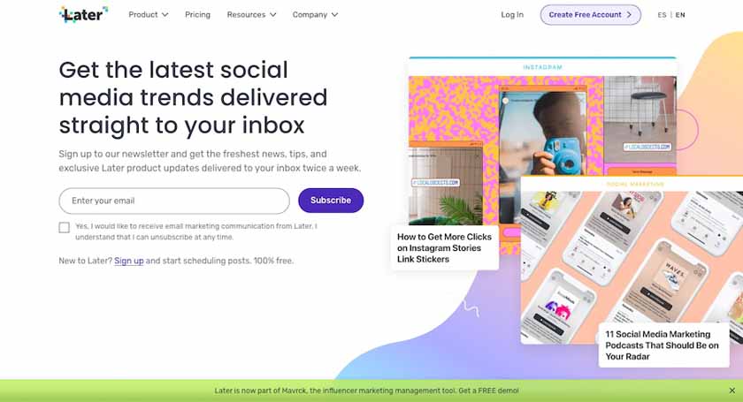
Later's newsletter sign-up landing page (Source: Later)
It goes without saying that the best landing pages are attractive and eye-catching. But for email newsletter sign-ups, vibrant colors and great use of whitespace will only get the site visitors' attention. To convert the subscription, you need to tell the site visitor what's in it for them. One of the best examples that combine both is Later's newsletter sign-up page.
Later's landing page combines great visuals with short but effective copy that promises to give subscribers the latest trends and tips on social media. The page's visuals even provide a taste of the content subscribers can expect from the newsletter. Combined with the one-field email sign-up CTA, it's a tried-and-true formula for creating effective landing pages that convert.
Source-Photos: fitsmallbusiness.com
The marketing power of Landing Pages - Blog
7 Habits of a Highly Effective Landing Page by Hubspot - Blog

19 Statistics showing “why website is important for your business” in 2023 - Blog
8 reasons why your business needs a website - Blog
How a small fishing equipment store built its brand thanks to its online presence - Blog
When you subscribe to the blog, we will send you an e-mail when there are new updates on the site so you wouldn't miss them.

