Website types
There are numerous divisions in which different types of sites can be described. Some of the first divisions were related only to static and dynamic sites, later static and dynamic got their subcategories with the development of new technologies and CMS systems. So at the moment it is possible to report a really wide and diverse division, but we have decided that it will still be a division into a couple of currently less popular types of sites.
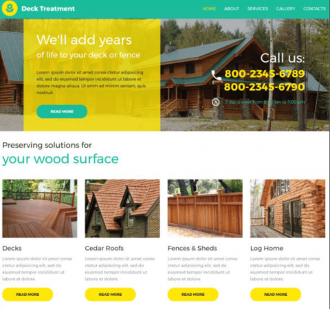
Presentation/Brouchure website
A presentation site is one of the simplest types of sites. It can be static and dynamic. Static means that the content on the created site will not be changed for a certain period of time, while the dynamic type includes a site where some part of the content will be changed often. This usually happens if news is inserted on the site, new information is often added or a blog is run within a dynamic site. A presentation site usually consists of 3 to 6 pages written in one or more languages.
The most common content is represented by textual and pictorial content with a general informational character by getting acquainted with the content, contact information and news related to the topic of the site. The presentation site is mainly used for presenting smaller companies, organizations, creating a personal site or portfolio site, presentation in CV form, promotion of a particular service or service in the simplest form, as well as for non-profit organizations and sites that present a product brochure.
Landing page
This is a website that is made with the goal of informing about the product and ultimately making two possible decisions: 1) to buy and 2) to leave some information because they are interested (collecting leads). If the goal is to buy immediately, we call it the sales page.
Landing pages are usually pages that are scrolled for a long time, where a story is told. As you approach the service, service or product at the bottom of the page through the story and information, there should always be a call to action.. A call to action is the moment when we ask people to do something - leave us an email address, call a phone, buy a product, download ebook....
All direct marketing campaign must have some kind of call to action, usually at the end of the landing page, but it can also be repeated several times during the text. A good copywriter knows at what point to put a call to action - usually at the moment when the visitor experiences the culmination of emotions that have slowly accumulated.
So actions on the page such as downloading an e-book, catalog, leaving an email address, booking a service, paying for an event ticket, downloading an application, downloading a document, ordering a product and service, logging in to inform about a particular product and service, button for any method contact (mail. Phone. chat) ( they represent a type of call to action which is essentially the most important element of a landing page.
Often represents a page of informative character related to a certain area, and or more of them. The web portal is most often used as a magazine, newspaper, tourist news, educational institutions, political and non-governmental organizations that have a diverse program and content that changes frequently. Also, portals can have a section for registration of members where with a certain level of access to the site it is possible to access content that is not publicly available without registration.
Appointment and Booking websites
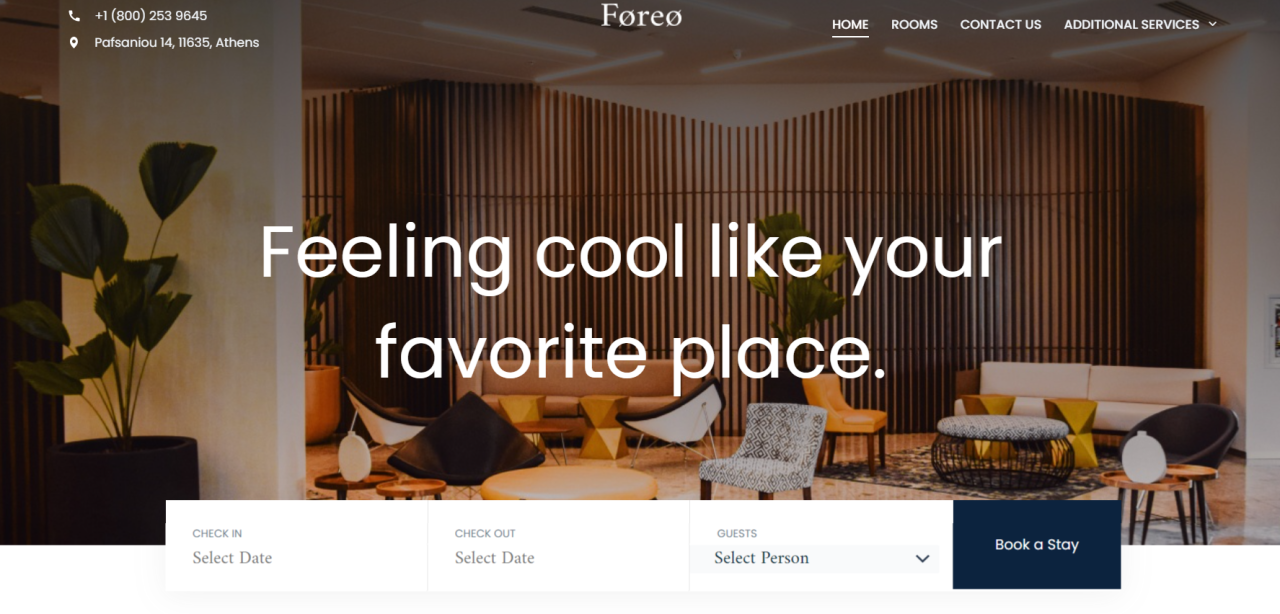
Appointment and booking websites are essential for many small businesses that require scheduling, such as salons, clinics, consultants, and trainers. When selecting an appointment or booking solution, it's essential to consider the specific needs of your business, such as the volume of bookings, required integrations with other tools, payment processing needs, and your budget. Each of the above platforms has its unique strengths, so it might be beneficial to test a few before making a long-term commitment.
Some of the appointment booking websites are: Beauty and Personal Care Health and Wellness Medical Professionals, Consultants and Coaches, Home booking websites and Auto Services, Hospitality and Travel ,Real Estate and Facilities...
Listing website
Most often include sites with a large database of content related to certain areas such as real estate offers for purchase, offers of various types or from a certain area, directories of companies for a certain geographical area, job offers, classifieds and many more. The listing group of sites also includes so-called booking sites such as accommodation reservations, renting a car, offering restaurants with online reservations, sites for online ticket booking for various events and the like.
This type of site is a slightly more complex type of site and requires a significantly longer time period of development, depending on the size and variety of the lists that are inserted. There are also significant investments in the purchase of add-ons for reservation systems, the purchase of site themes adapted to these tops of sites, and if necessary in some cases the integration of payment systems, automation of mail marketing add-ons and the like. For this reason, these types of kits are more complex to create, require more develop time as well as additional costs for the purchase of plugins .
E-learning
These sites are dedicated to education platform that use some of the CMS learning systems. They are used for online education, and have options that provide live or lectured online lectures, written lesson materials, chat communication, a system for sending messages and comments. They also have the ability to set quizzes and tests. They are mostly of the closed type and they are accessed through the obtained code, so that everyone has their own learning account.
E-commerce
An e-commerce site, also known as an online store or web shop, allows you to pay for products or services online. Stores can function as standalone websites or be combined with a blog or corporate website depending on how many service products are sold. For example, a clean corporate website without e-commerce functionality can still indirectly encourage users to buy something, but cannot accept any payments.
Creating a store is a more complex type of web platform and depending on the size of the store. The number of products, other elements are adjusted such as hosting, site protection, purchase of necessary accessories, integration of payment systems and many other details that must be defined before building. there would be no unplanned problems later.
cover photo: enestservices
11 Types of Websites to Inspire by Hubspot
Business Website (Portal website type)
A business website is a company's digital presence — it presents a business for visitors. While business websites come in many sizes and shapes, they all aim to present the business's products and services to visitors in a way that acquires new customers, clients, and/or partners.
Usually, business websites include descriptions of their offerings, and a way to either purchase through the website or contact the team to initiate a sale or partnership. From there, it's all up to the business to decide what to include on its site — some sites are dense, while others are stripped-down with just one or a few pages. It's all about what best aligns with your branding and what your target market wants to know.
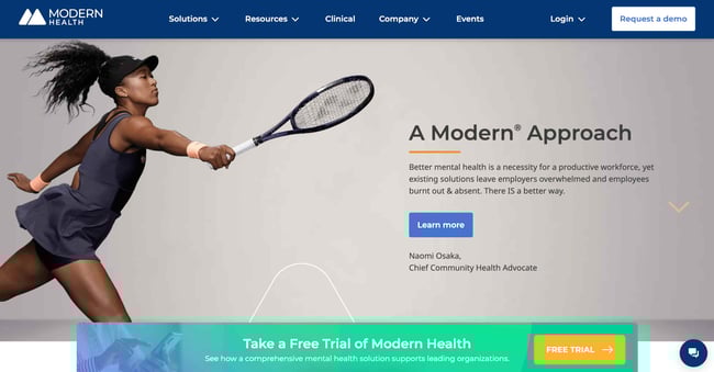
Let's look at two business sites that show this contrast. Modern Health is a personalized mental healthcare delivery service with a website that explains the app's purpose, value, features, and plan options for employers. It accomplishes this with a mix of copy, videos, testimonials, infographics, and blog posts.
What We Like: Modern Health's website lays bare everything you need to know at a glance. It draws attention to the mission statement, while also providing social proof through spokeswoman Naomi Osaka.
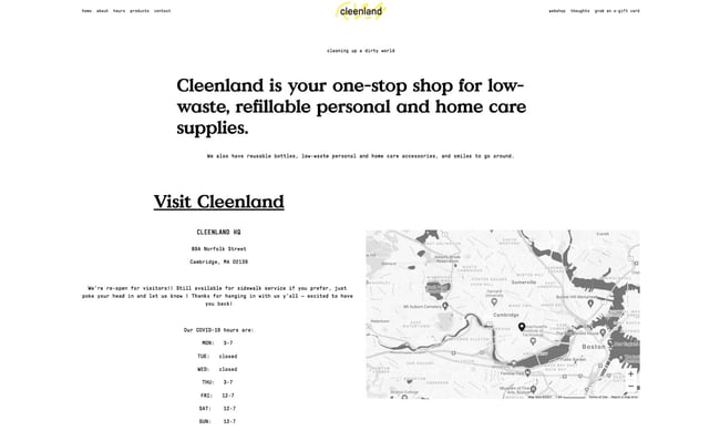
In contrast to Modern Health's content-rich site, the website for Cambridge-based low-waste shop Cleenland has no frills. The layout and design choices are simple to give prospective customers all the information they need when planning a visit.
What We Like: This simple website design echoes the company's mission statement of reducing waste. Cleenland brilliantly employs white space to draw attention to the content that matters.
2. Ecommerce Website
Ecommerce websites sell products, be it physical goods or digital content. Visitors can browse the website's listings, read up on product details, and purchase directly from the website. Ecommerce websites are focused entirely on retail, but business websites, blogs, and other website types may also host an online store for selling products or merchandise.
Ecommerce sites sell all sorts of things, but most stick to a familiar model — products are categorized and presented in a list format, and clicking an item brings users to a dedicated product page. Visitors can usually search for products as well via a search bar. On each product page, visitors can add the item to a virtual "shopping cart" or "shopping bag." At any point users may enter the checkout process, in which they enter shipping and payment information to complete a purchase.
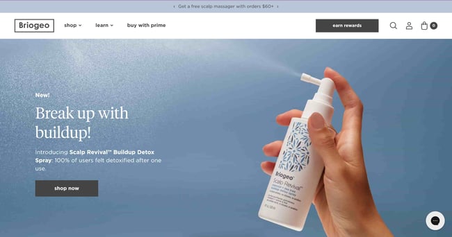
For an example of a visually engaging, informative ecommerce site, check out Briogeo Hair Products. Its pages capture attention with a rich pastel color palette to highlight its different products. The navigation menus include product thumbnails to reduce reading, and it displays its mission, results, and blog sections prominently alongside its shop.
What We Like: This website boasts an exceptional design that seamlessly combines captivating visuals, intuitive navigation, and compelling storytelling to create an immersive and user-friendly experience.
3. Blog
Blogging sites are difficult to define since their use has evolved so much over time. The blog (short for "weblog") format began as a way for anyone to publish casual, long-form written content about their interests. Since then, blogging has been adopted by entrepreneurs and businesses to mark their presence online. Today, we can consider a blog to be any website that publishes written content in the form of articles (or blog "posts") based around a topic.
If you're an online business, a well-written, informative blog can be a major asset to your marketing strategy. It brings traffic to your site, establishes authority on search engines, converts visitors to leads, and eventually convinces those leads to take the next step to become customers. A blog that's relevant to your business niche proves that you're knowledgeable and committed to being the best in your industry.
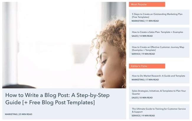
If you need an example of business blogging in action, you're looking at one. HubSpot writes four popular educational blogs — Marketing, Sales, Service, and Website — each filled with articles to help scaling businesses grow better.
Entertainment Website (portal website)
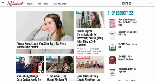
Entertainment websites aim to, well, entertain. Like blogs, the content on these websites takes the form of articles. However, there's usually a larger team behind these websites to produce content in larger volumes. Take Reductress, a satirical news website that pokes fun at magazines and media targeted at women.
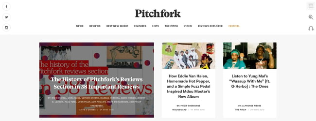
What We Like: The site's design itself is modeled after the news outlets it parodies, right down to categorizing posts by topic, and pairs hilarious titles and subtitles with stock thumbnails to encourage clicks\You might have also heard of Pitchfork, a music review site that has been around since 1995.
What We Like: Pitchfork has a cohesive, elegant frontend design, a sharp color scheme throughout, and clear navigation for everything the publication offers, including reviews, news, and its music festival.
News Website (Portal website type)
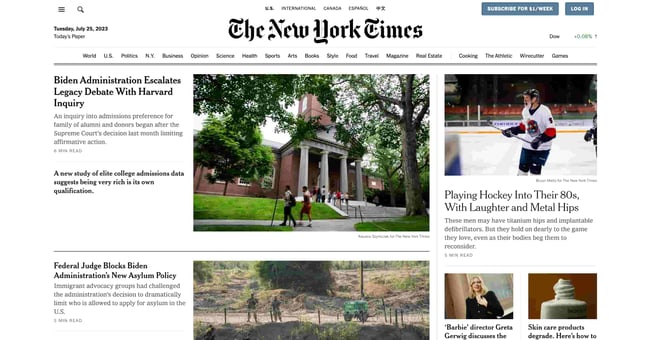
News websites are like entertainment sites, but mostly comprise news reports. As such, these sites aim to inform more than entertain. News websites also tend to have a notably different aesthetic than entertainment websites, often with a cleaner layout and aesthetic. Take The New York Times — it heavily uses a grid layout to present the latest stories and typography to mimic its printed counterpart.
What We Like: Despite being renowned for its authoritative journalism, the New York Times skillfully incorporates elements of sleek design, engaging visuals, and user friendly interface to deliver an outstanding news website experience.
In place of on-page advertising, many news sites offer a subscription for access to their content. The New York Times limits the number of free articles users can view before they must purchase a subscription. Other online news publications place part of their articles behind a paywall, or limit the number of free daily articles.
Nonprofit/Organization Website (Portal website type)
Websites are one of the best ways to establish legitimacy for a business, and the same can be said for nonprofit organizations and non-corporate entities. These types of websites serve to promote an organization, communicate the organization's purpose, and often request and field donations.
Just because your site isn't selling a product service, that doesn't merit a shoddy design. To be effective, a nonprofit's website must clearly convey its mission and goals from the homepage with emotional weight, with additional pages going more in-depth on individual projects and initiatives. Your site may also list organizations you've collaborated with, testimonials from those you've served, a calendar of future events, and a donation CTA to capture new contributors while they're engaged.
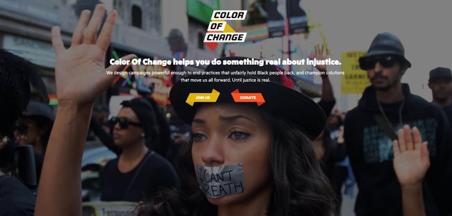
Nonprofits can employ different design approaches too.
What We Like: Color of Change meets you with a fullscreen background image and clear CTAs on the first page. Visitors can scroll to learn more, but this design choice makes a strong first impression for new visitors and potential donors.
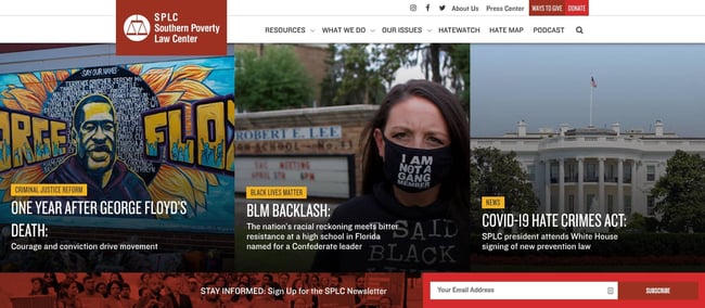
Take Southern Poverty Law Center, another American nonprofit as an example.
What We Like: approaches its homepage design like a news publication might, with image tiles corresponding to stories and updates. It also prioritizes a CTA encouraging visitors to subscribe to its newsletter.
Membership Website
Membership websites require visitors to register an account to take full advantage of what the site has to offer. These sites range from educational resources to web apps to news and entertainment publications. In all of these, some or all valuable content is protected and only available to "members" of the website and, in many cases, requires payment to access.
How exactly a membership site's content and services are gated varies widely — some websites reserve all content for members, while other websites make some items free and others exclusive. Membership websites may accept one-time payments for access, be subscription-based, or require no payment at all, just a sign-up. Blogs, entertainment sites, and news sites have been shifting to this model to generate revenue.
Scott's Cheap Flights is one example of an effective membership site
Portfolio (Presentation/Broshure Website type)
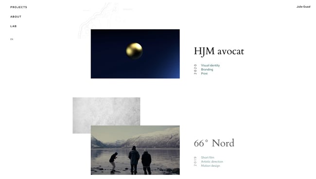
Online portfolios are a great way for creative freelancers and agencies to present their work. Whether you specialize in painting, illustration, film, photography, graphic design, sculpture, prose, or poetry, you can craft a portfolio website that showcases your creative best.Portfolios are also an option for professionals outside the arts — for instance, programmers can build portfolios for their coding projects, and marketers can use portfolios to recount their most effective campaigns. There are thousands of portfolio websites out there to inspire yours. France-based freelance designer Julie Guzal's is just one example.
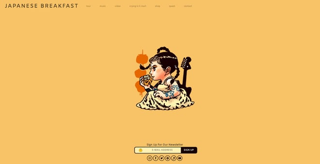
The minimalist, broken grid layout places focus on her body of work, with several small design quirks to make it memorable. There's also a prominent (but not distracting) contact button near the bottom to get in touch. Musician websites are another great reference for innovative design. The band Japanese Breakfast updated its site's visuals to accompany an upcoming album release.
Again, we see a prominent CTA on the homepage, with subtle links to view their music, tour dates, and more.Since creative professionals and agencies utilize portfolios to land work with clients, these sites lean more formal in their presentation. For a more casual approach, you might consider a personal website, which we'll cover next.
Personal Website
A personal website is all about you. Use it as a medium to express yourself and your thoughts through writing, projects, visuals, or media, as long as it reflects your unique perspective.
The goal of your personal site is also up to you — if you want to use a personal site to advance your career, you could post your resume detailing your work experience and consider adding a bit more visual flair than a plain PDF file. If you're an entrepreneur, a personal website establishes your personal brand. Or, you might just need an online space to vent your ideas — doing so has never been easier.
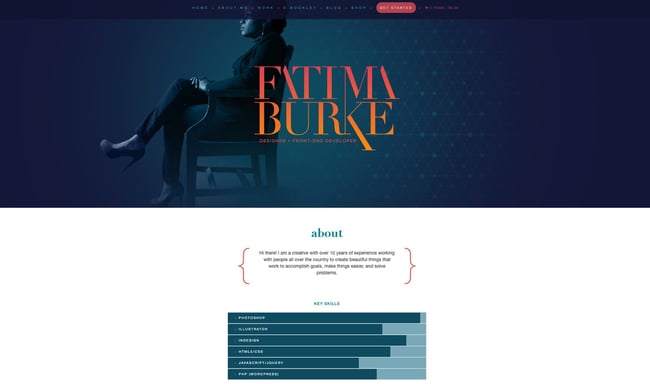
As one example, the personal site of front-end developer and designer Fatima Burke exemplifies a more professional take on the personal site, listing skills, clients, projects, and products.
What We Like: This website is great as a personal resume, as it immediately displays the about section and key skills in an easily digestible manner.
Source: Hubspot/ 11 Types of Websites to Inspire Your Own [+ Examples]

11 Types of Websites to Inspire Your Own [+ Examples]

Are the presentation site (brochure) and the landing page the same? How are they different and what do they have in common? - Blog

The marketing power of Landing Pages - Blog
16 reasons why your business needs a website - Blog
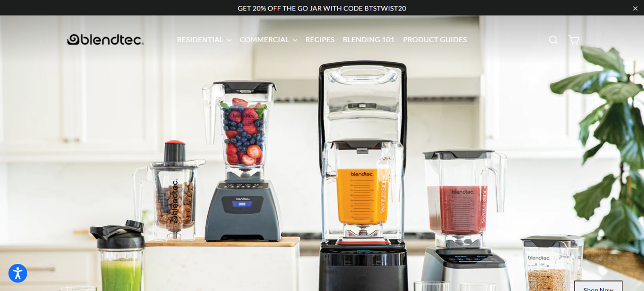
Blendtec - A great example of building a strong online presence and brand awareness - Blog
When you subscribe to the blog, we will send you an e-mail when there are new updates on the site so you wouldn't miss them.


