What is Website consistency and why is important ?
The need to be consistent in web design is one of the first things many designers learn. And despite the fact that it is a core tenant of good design, consistency can be difficult to obtain. Whether that is due to the scale of the project or other stakeholders want to have their say, entropy is a law for a reason.
In this post we are going to take a look at some steps you can take to make sure your website has consistent design.
What is Design Consistency?
Let start by defining what design consistency is. Design consistency is the act of keeping all of the repeating elements of your website the same throughout the entire site. This encompasses everything from the placement of buttons and icons to the colors and fonts you use. While this seems easy enough to achieve, it is another one of those examples in life where it is much easier said than done.
Benefits of Design Consistency
To put it briefly, the user experience improves when you use consistency in your design.
Consistent design is intuitive design. Having the same functions, symbols, and animations throughout your website will help the usability and learnability of your website. When your design is consistent people are able to transfer past knowledge they had about your website to other pages. Don't underestimate the importance of this. Have you ever been frustrated by a website? Chances are it was designed with poor consistency.
If a website is designed with consistency, the user will learn things about the site without even realizing it. Imagine your website is the house you live in. You know your way around the house without having to think about it. When a guest comes over to your house the layout can be slightly confusing for them. The job of a designer is to be as consistent as possible to avoid confusing the guest.
There are three major elements of design consistency that need to be focused on to achieve avoiding confusion for your guest.
1. Visual Consistency
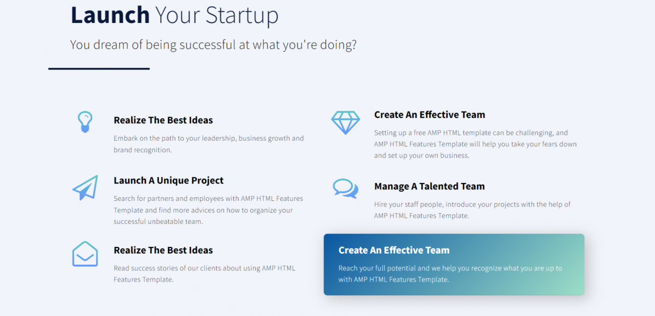
Elements of your website that are perceived the same way make up visual consistency. Visual consistency helps the user learn the website. Fonts, buttons, photos, and colors are just a few of the many elements of visual consistency. These elements need to stay the same throughout your site. Visual consistency is lost as soon one of these elements doesn't remain consistent throughout your site.
Photo: Gofishdigital
2. Functional Consistency
Functional consistency comes down to things being predictable for the user. Having good functional consistency will vastly improve the usability of your website. The predictability that comes with functional consistency will make the user feel more comfortable navigating your site.
An example of this would be where navigation buttons are located. Are they located in consistent places throughout the pages on your website? If they are, you're achieving functional consistency!
Photo: Gofishdigital
3. Internal Consistency
Internal consistency is the combination of both functional and visual consistency. As you continue to add content to your website you need to make sure the visual and functional elements remain consistent with past pages. An example of bad internal consistency would be updating visual elements on a page on your website without also updating past pages that contain those same older elements.
If you achieve these three elements of design consistency it will result in a better site where the users will have a more enjoyable experience.
Branding, typography, colors, space, and grid will all define the visuals of your website. These need to consistent. You'll want to create a strong visual hierarchy, the most important things are larger than the less important things. Use the same color palette across the product. Padding and margins need to be consistent in all similar elements (buttons, forms, etc.). Everything should be ordered in a grid and nothing on the website should break this grid.
Essential Elements of Usability on a Website
● Company logo on top of every web page
● Smooth and consistent navigation
● The main navigation on the top portion of the web page
● The lower portion of the web page should consist of secondary navigation
● Search function for better usability
● Consistent font type and size
● Consistent content
● Consistent graphics
● Consistent HTML map
Importance of a Consistent Web Design
Professionalism
If all the minor, as well as significant elements present on different web pages of a website, are consistent, then this presents the site in a much more professional manner.
Mixed reactions often end up in confusion and of course, being a service seeker; Nobody would prefer a service provider whose website is confusing him or her!
The best way to bring a professional feel to website design is to keep things simple and straight forward
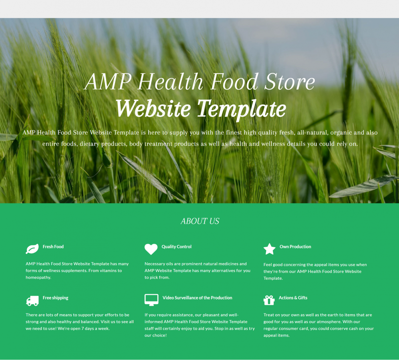
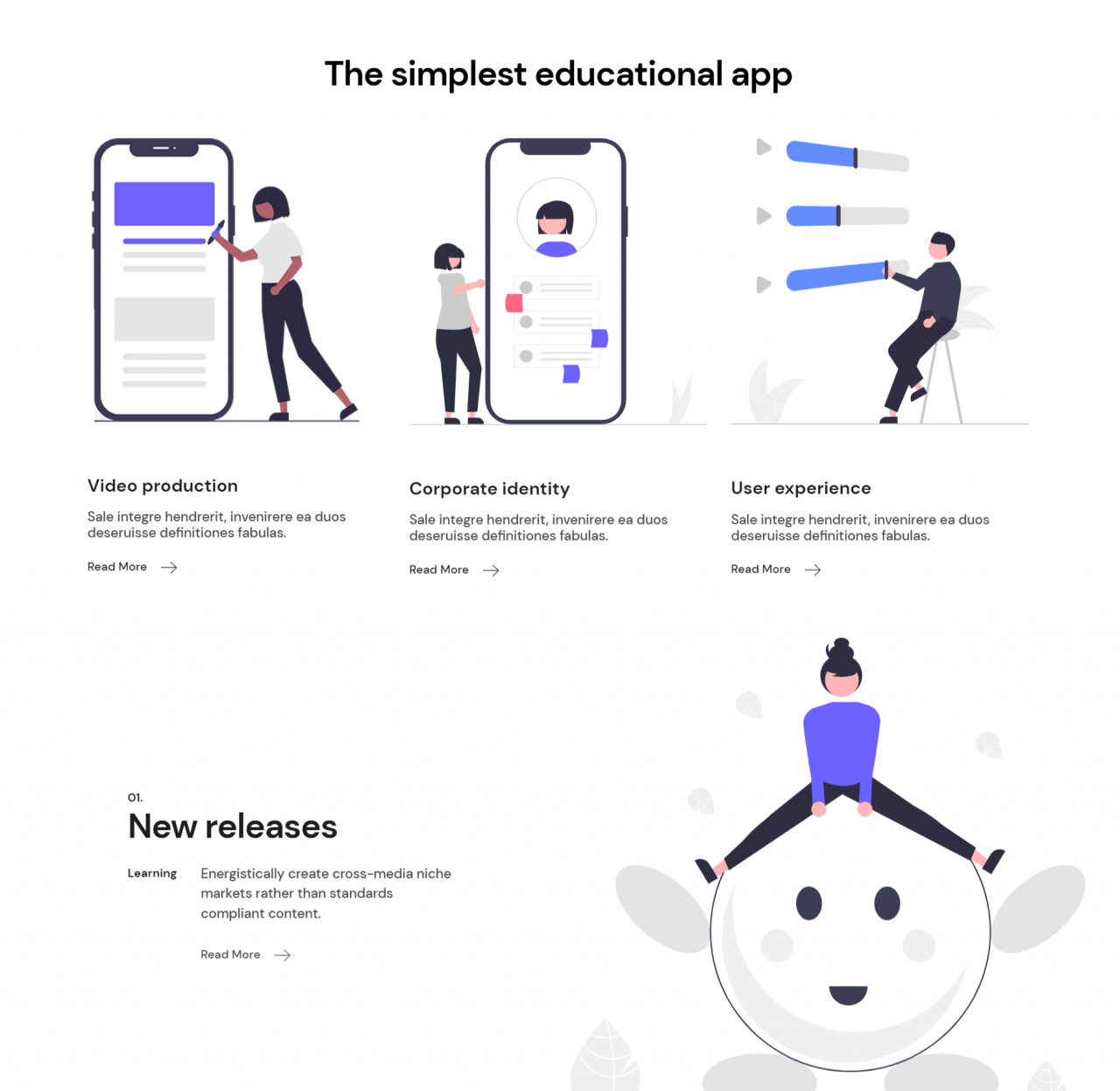
Please avoid the use of excessive bright colours; perhaps it is better to keep the number of colours used on a website to a maximum of four. Similarly, the number of fonts used in a single website should not be more than two or three. Introducing variations with the intensity and size of the font used is a significant respite, but colours and font style are something that a visitor gets familiar with much quicker.
Photo: Mobirise Template
Fonts
Fonts play a pivotal role in maintaining a consistent web design, which is why font type and size are something that a webmaster needs to keep in mind.
The font family in the cascading style sheet should be kept universal, and that includes throughout the website pages.
While editing the content in HTML, the editor often forgets about the association of the website design with the CSS file, which is why the fact regarding changes going live remain untouched.
Another area where inconsistencies occur the most is the font-size element in the CSS file, and a webmaster should consider editions in the CSS file itself rather than making amendments via HTML editor.
Photo: Mobirise Template
Graphics
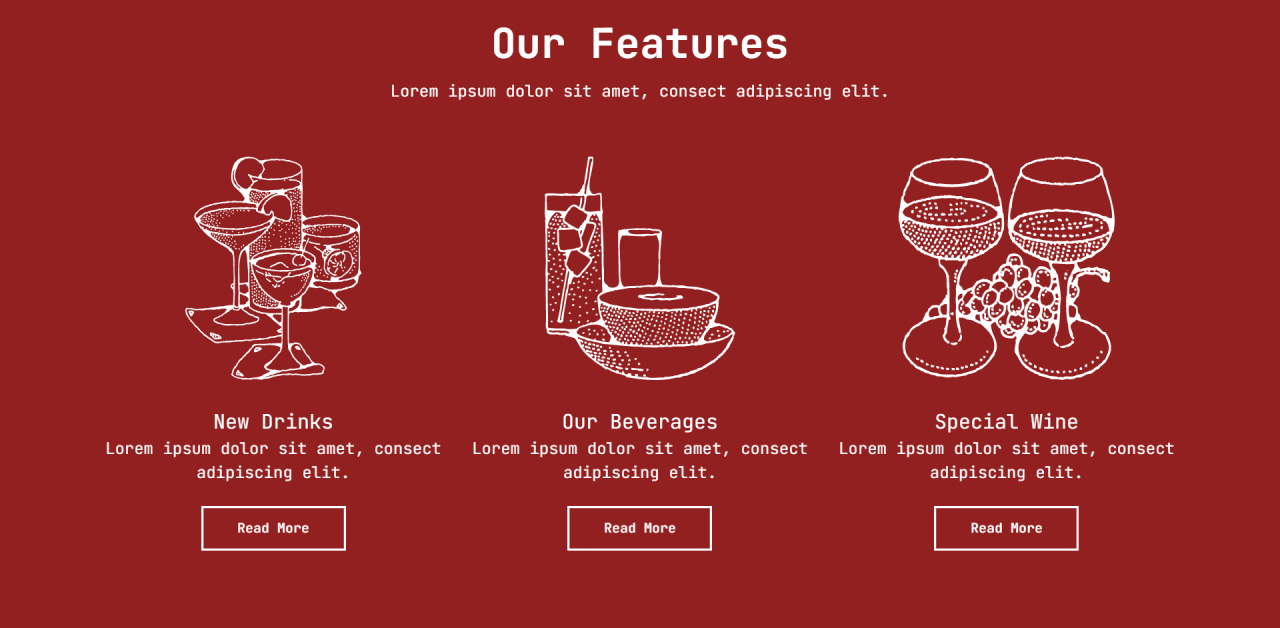
Graphics are the website elements that define the look and feel of the website, which makes them one of the most critical elements to a coherent site.
If you have specified additional graphics apart from the website design, then you should keep them similar to the original design.
The key to consistency in the case of additional graphics is that they should not seem to be an add-on, but a part of the website graphics.
The best way to ensure graphical consistency is to hire one designer to do all your artwork and image.
Photo: Mobirise Template
Consistency with Website Links
Links within the website are the best way users move within your website. However, they also happen to be the best way one can improve website consistency. Please make sure the links are a stand out when it comes to visibility, and besides that, your links should be easily visible to a visitor. Links present within the website have to be descriptive and attaching just a 'Click this' is something that can be considered as Old fashioned. Adding a descriptive sentence to the link is the best way to let a user know 'what the link is actually about?'
Use Correct URL Structure
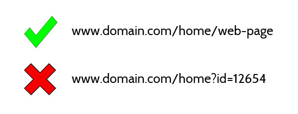
You probably noticed that there is a high number of websites that uses clean URLs; you should do the same. Clean URLs with your keywords in them are a great way to show Google and other search engines what the page is about before the spider even takes a look at the page and it brings more relevance to the table. Below are examples of what your URLs should look like and how they should not look like.
Optimise Your Images
Images are a great way to make your website interactive and attractive to your readers. We all use images for backgrounds, headers and almost on every single post page. There are two things you need to do with each image you plan to upload and embed on your website. You first need to name it correctly, and then you have to add the ALT tag and a title.
Create a Blog
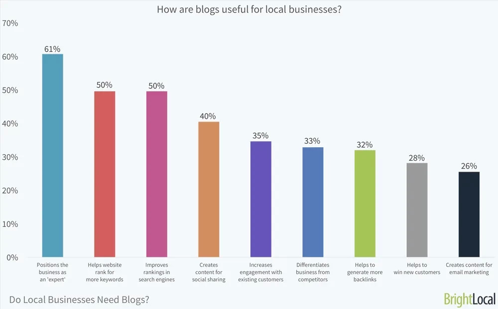
It doesn't matter what type of industry you are in; any business or company can use and maintain a blog. The benefits of a blog are endless. The most obvious is that you will keep interested parties up to date on any happenings of product/services related news. Still, at the same time, a blog gives you a unique opportunity to add more relevant keywords to your content and make your website even more relevant. And there is also the fact that a blog can drive more traffic than a static website, but that is a part of a promotion and social networking rather than the blog vs static page dilemma.
Consistency with Content
There is a world of difference between reading content in a book and reading stuff on a website! However, the similarity in both aspects is that a user, before starting with the reading scans the page in advance to make sure whether the content is worth reading or not. No matter how informational you are sounding compressing the valuable data in a single page will make things seem dull to a reader.
Consequently, the proper use of white space between the content is necessary. Information on the website should be clearly defined by formatting the content into Heads and Subheads. Information on the website should be clearly defined by formatting the content into Heads and Subheads. Moreover, text alignments on every page should be a standard same to make reading a much less troublesome affair.
Sources: Inkbotdesign / Gofishingdigital
When you subscribe to the blog, we will send you an e-mail when there are new updates on the site so you wouldn't miss them.

