Portfolio websites that inspire
Nathalie Lete
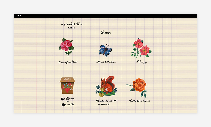
Nathalie Lete's clever homepage resembles a sketchbook, featuring a gridded background with her own illustrations. The various pages making up Nathalie's portfolio are connected by a unique navigation menu, indicated by handmade illustrated icons spread throughout the page, giving attention to her artistic skill. This site is a great example of how you can go way beyond a standard website layout when making an art portfolio, in order to put your creativity and important visual elements in the forefront.
Michelle Carlos
Using your own artwork as a background on your website is a common practice when creating an art portfolio website. In Michelle's case, a personalized splash page showcases an illustration of hers, giving visitors an exciting introduction to the artist's expressive world.
At the center of her homepage, Michelle's intricate logo functions as a customized button, providing a gateway to the rest of the site. The image itself is a great representation of her art, and it's deftly re-used as a well-designed favicon to give her site a professional boost.
Alef
Characteristic of his street art background, Alef's portfolio has his proverbial signature all over it, bedazzling each section page with his own illustrations. In addition to selling art online, Alef encourages potential customers to buy works in person by inviting them to his Tel Aviv-based studio.
A welcoming message, behind-the-scenes photos, and the use of a Google Maps widget are all smart ways to get local fans to pay Alef a visit. Additionally, the use of a Live Chatbox widget will encourage interested viewers to reach out and ask questions.
Steve Wolf Designs
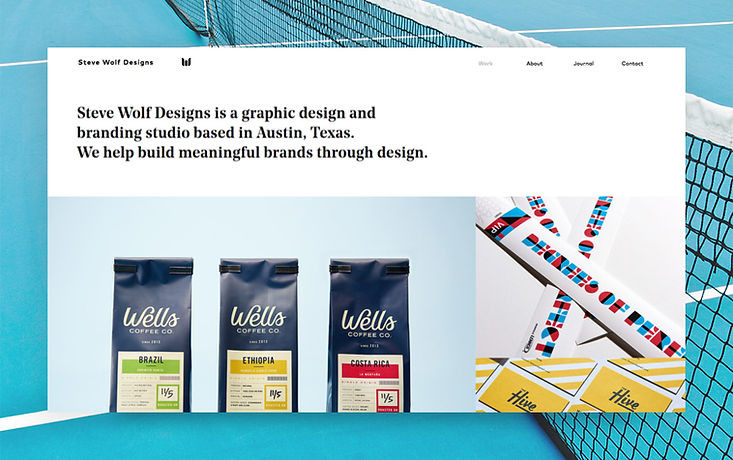
With the super sharp high-quality visuals on Steve Wolf's design portfolio website, it almost feels like you can reach out and grab the products photographed. The organized grid layout and screen-to-screen visuals put the emphasis on the works themselves.
A discreet hover effect on each image reveals the name of the project, while keeping text to a minimum. To make a portfolio in a similar style, head over to this template. You can add your own works and adjust the design to express your style. You'll also find plenty more on which you can base your design.
David Milan
Designer, art director and hand lettering artist David Milan places his art center stage. By including only the most crucial elements on the header and opting for a simple monochrome palette, David draws visitors' eyes directly to his colorful designs.
His gallery of works spans the width of the screen, making up the majority of the website. David has used the Wix Pro Gallery to form a feed-like website layout that visitors are invited to scroll down. This straightforward structure allows for more and more images to be uploaded, making for a design portfolio that is easy to update as his body of work expands.
By Experience
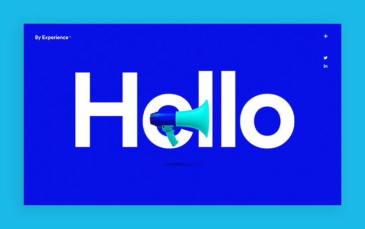
An energizing cobalt blue fills the screen on design agency By Experience's homepage. Adding to this dynamic sensation is the fast-paced animated text on the top fold of their site. The tone of voice is self-assured and to-the-point, inviting visitors to reach out and hire their services.
As opposed to the other portfolio websites in this selection, By Experience shares their work alongside testimonials by satisfied customers. This demonstrates their skills and past successes, helping to attract potential clients. They make it easy for visitors to contact them by including a static floating menu icon in the top right-hand corner that leads to an online form for getting in touch.
Mathias Holmberg
This architecture portfolio offers a simple yet powerful representation of Mathias Holmberg's work. Vertical and horizontal images are pieced together in a grid with white space between each to display the range of his capabilities. The color palette used on both the website design and the images emcompasses soft neutral tones, offering an inviting, approachable online space.
Unlike other portfolios, this site contains very minimal links or navigation. The only other link you'll find leads to an Info page with contact details and a link to the architect's Instagram. Likewise, there is very limited written content, allowing Mathias' talent to shine through in images alone.
Glory Sam Jolly
A full screen slideshow greets visitors to Glory Sam Jolly's site, showing off an array of realistic portraits made by the talented artist. High quality photography is key here—allowing the images to become so tangible, we can almost smell and feel the layers of oil paint applied to each canvas.
In addition to a portfolio and a blog, Jolly includes a list of featured publications on her site. Here, we can read texts by the artist herself, along with detailed reviews of her work. For visitors who want to acquire a Jolly original, these "extra" insights will help them connect even more deeply with Jolly's artistic practice.
Witoldziomek Photography
A very interesting and inspiring portfolio website. Travels and unusual photos from different parts of the world. Among other things, the author of this portfolio site says about himself and his awards as a photographer
I'm Witold from Krakow, Poland. I found photography the way to feel fulfilled while travelling. Photography is my few years old quite unkempt passion. In 2017 my both passions finally got combined. I'm not a fan of crowdy, noisy places but prefer outdoors. Wilderness, silence close to the nature is what I really seek when I travel. Sometimes I'd like to be in few places at the same time in order not to miss anything. In my opinion 2h at home is a waste.
ACHIEVEMENTS2019 Skypixel - 2nd prize in category
ARCHITECTURE [here]2018 Sony Awards - Commended in category
LANDSCAPE & NATURE [here]
2018 Chromatic Awards - 2nd prize in category PHOTOJOURNALISM [here]
2018 Chromatic Awards - 3x Honorable Mention in category LANDSCAPES
[here]2018 Drone Awards - commended in category WILDLIFE [here]
2018 Hydropolis - GRAND PRIX [here]....
https://witoldziomek.com/
Source and screenshots: Wix
When you subscribe to the blog, we will send you an e-mail when there are new updates on the site so you wouldn't miss them.


