10 Presentation (Brochure) Website Examples to Inspire by Hubspot
What is a presentation website
A presentation site is an online platform that presents your company, its products and services. It is your digital business card, providing details about your business, vision, goals and values.For small businesses, a presentation website is extremely important. It is a means by which you can attract new clients, associations, potential collaborators and investors. Regardless of whether you are a restaurant, craft shop or online store, a presentation site is a channel through which you can show exactly what you do and how you differ from the competition.
What benefits does the presentation site bring
Presentation website as a "digital business card" for a small business emphasizes its role in providing essential contact and business information in an easily accessible manner, just like how a physical business card would. It's a compact, efficient way to let potential customers or clients know who you are, what you do, and how they can reach you.
- Visibility: In today's digital age, many consumers first look online when searching for a product or service. Even if they've heard of a business through word-of-mouth, they often want to check out its online presence before making contact.
- Credibility: Having a well-designed website makes a business look more professional and trustworthy. It provides a sense of stability and shows that the business is keeping up with modern practices.
- Accessibility: A website is accessible 24/7, allowing potential clients or customers to learn about the business at their convenience, outside of regular business hours.
- Informational: Through a website, businesses can provide detailed information about their services, products, pricing, etc. They can also showcase previous work, customer testimonials, and other credentials that might convince a potential customer of their expertise.
- Engagement: Allows the business to engage with visitors using forms, chat functions, or blog comments.
- Cost-Effective Advertising: While there's an initial cost to set up a website, maintaining it is relatively low-cost, especially when compared to traditional advertising methods. Over time, it can be a more cost-effective way to get the word out about your business.
- Interactive Engagement: A presentation website isn't just static; it can also be interactive. Contact forms, blogs with comment sections, chatbots, and sign-ups for newsletters can provide ways to engage with visitors and turn them into customers.
- Market Expansion: A physical store or office is limited to its geographical location. In contrast, a website is accessible from anywhere in the world, opening up potential markets that the business owner might not have previously considered.
- Easy Updates: Business information, such as services, prices, or contact details, can change. With a website, it's easy to keep everything current. Some platforms even allow the business owner to make updates without any web design experience.
- Analytics: Having a website allows businesses to use tools like Google Analytics to understand their visitors better. They can gain insights on how visitors interact with the site, which pages they visit the most, where the traffic comes from, and more.
- SEO and Online Marketing: With a presentation website, businesses can also work on their search engine optimization (SEO) to rank higher on search engines, bringing in organic traffic. Plus, it provides a base for other online marketing efforts, like pay-per-click advertising or social media marketing.
In essence, in the modern business environment, not having a presentation website can be a missed opportunity for small businesses. Even if they don't engage in e-commerce, having an online presence can provide significant advantages.
According to small business website statistics, 36% of small businesses do not have a website, while 81% of consumers research products or services online before purchasing. These numbers demonstrate the importance of small businesses investing in a website to reach and engage with their target audience.
Key Finding: Small Business Website Statistics
- 71% of small businesses have their own website.
- 75% of consumers judge a business's credibility based on their website
- 81% of shoppers research a business online before making a purchase.
- Small businesses with websites grow 2X as fast as those without.
- 48% of people said that the number one factor they used to determine a business's credibility was their website design
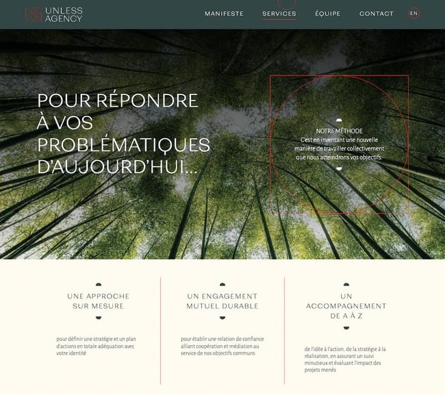
What we like: Unless Agency is a simple brochure website that explains the company's mission and history, services, team, and contact information. Many of its pages have a two- or three-column layout with divider lines that look like folds of a printed brochure.
Unless Agency is a simple brochure website that explains the company's mission and history, services, team, and contact information. Many of its pages have a two- or three-column layout with divider lines that look like folds of a printed brochure.
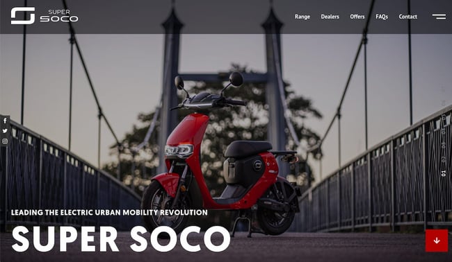
What we like: Super Soco is a clean and modern brochure website. Designed to showcase the UK's most popular provider of electric motorcycles, this site uses multiple image sliders, animations, and minimal text.
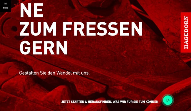
What we like: The Hagedorn Group is a full-service provider in the construction industry. It is the only company to unite all services in the process chain, from demolition, site remediation, disposal and recycling to civil engineering and revitalization. Created to reflect the company's vision and unique services, the brochure website provides information about its process chain, academy, and innovation as well as its contact information.
What we like: Yomira is an elegant brochure website for the luxury yacht charter business. It uses high-quality images, clear messaging, and simple user journeys to enable visitors to learn more about the company and get in touch.
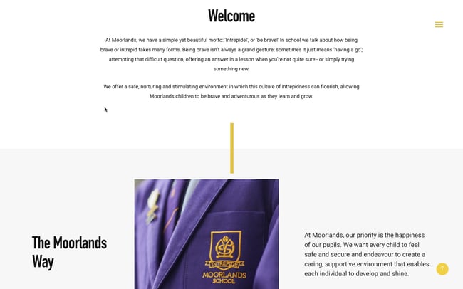
What we like: Moorlands School is a brochure site for an independent school in the United Kingdom. Each page is structured like a brochure, with lots of images and white space and little text, but uses scrolling animations to make the experience more engaging than flipping a page.
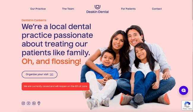
What we like: Deakin Dental is a dental clinic in Australia that uses the latest dental technology and techniques to provide high-quality dentistry. The homepage of the brochure website features a hero image and then a unique two-column layout with scrolling animations. Reminiscent of a bi-fold brochure, this section lets prospective patients know more about the team that will be taking care of them and invites users to submit their contact information to book a visit.
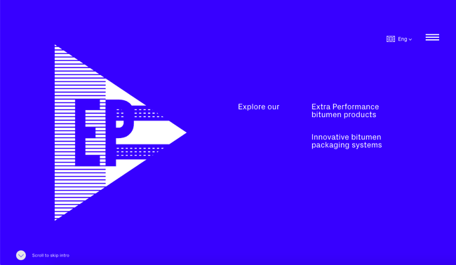
What we like: Ep Bitumen is a brochure website for a road construction company. The vertical scrolling animation not only evokes the idea of flipping through a printed brochure — it also breaks down what the company does and what its products are into more digestible, bite-sized chunks of information.
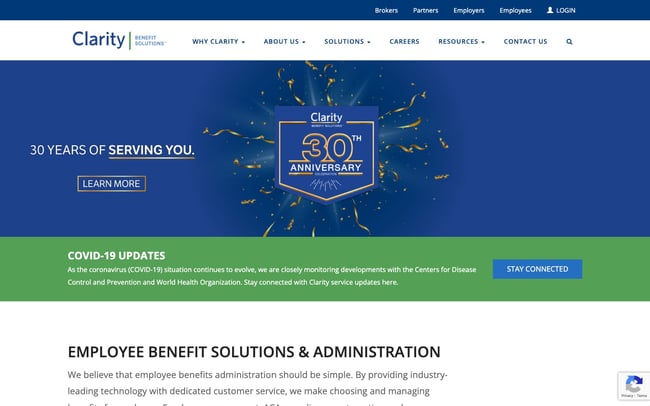
What we like: Clarity Benefit Solutions is a brochure website for a national benefits solutions provider. This site details its full suite of programs and industry-leading technology and dedicated customer service. Through strategically-placed CTAs and forms, visitors are invited to log in, schedule a demo, sign up for their newsletter, and stay connected in other ways.
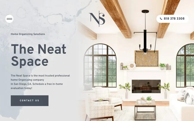
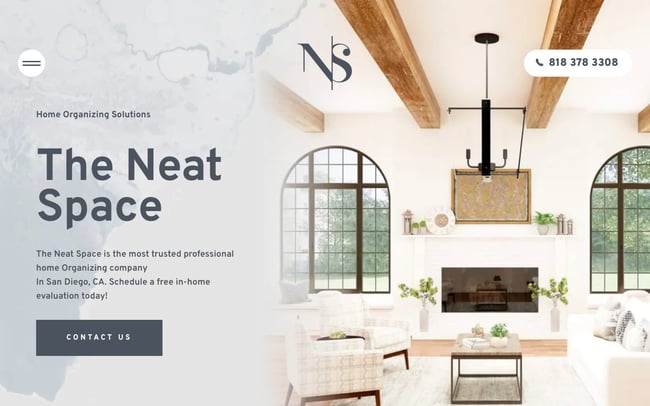
What we like: The Neat Space is a professional organizing service for clients with cluttered homes in San Diego, California. Its brochure website clearly explains its services and invites visitors to schedule a demo or contact them. Visitors can view case studies, read customer reviews, and follow The Neat Space on Instagram to learn more before getting in touch.
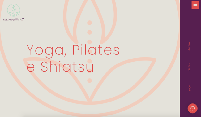
What we like: Spazioequilibrio7 is a fitness studio in Italy that offers classes and treatments in yoga, shiatsu, pilates, and more. By visiting the brochure website, you can get a broad overview of each type of class and treatment. If you need more information, you can submit a form on almost every page.
Source: Hubspot

10 Brochure Website Examples to Inspire You in 2022 [+ How to Make One]
Optimonk: 14 Ecommerce Case Studies to Inspire You - Blog

Small Business Websites and Marketing Statistics 2023 by BusinessDIT - Blog
16 reasons why your business needs a website - Blog
When you subscribe to the blog, we will send you an e-mail when there are new updates on the site so you wouldn't miss them.

